
A Better Way to Look at Portfolios
Summary: Fund managers lack quality tools to visualize their portfolio and understand its key drivers. Sherpa Funds Tech created the Risk Quality Graph as a tool to help managers understand simplify complex portfolio construction by illustrating how expected returns, asset riskiness and co-movement interact to drive portfolio construction decisions. The Sherpa Risk Quality Graph lets managers quickly analyze their portfolio at the asset-level to improve decision-making around portfolio construction.
How Do You Look at Your Portfolio?
Many fund managers spend most of their time focused on selecting the best assets to include in their portfolio. They largely view their complete portfolio through the lens of simple summary statistics. Values such as VAR, volatility, drawdown, Sharpe, and more reduce the portfolio’s complexity into single descriptive numbers.
On the other side of the spectrum lie dense, complex tabular views such as those in a spreadsheet or portfolio accounting system. These views list data point after data point such as the weight in the portfolio, the position size, P&L and other asset level statistics, but ultimately provide little clarity about how the assets interact and the shape of the entire portfolio.
Very few fund managers have access to visual tools that can help them quickly understand the makeup and key risk drivers of their portfolio positioning. As a result, they have limited visibility into how individual asset decisions impact the portfolio as a whole.
The Risk Quality Graph
In this post I’ll introduce a unique tool we’ve developed at Sherpa Funds Tech to help fund managers visualize their portfolio holdings and better understand their entire portfolio. We call this tool the Risk Quality Graph, pictured here displaying an anonymized client portfolio.
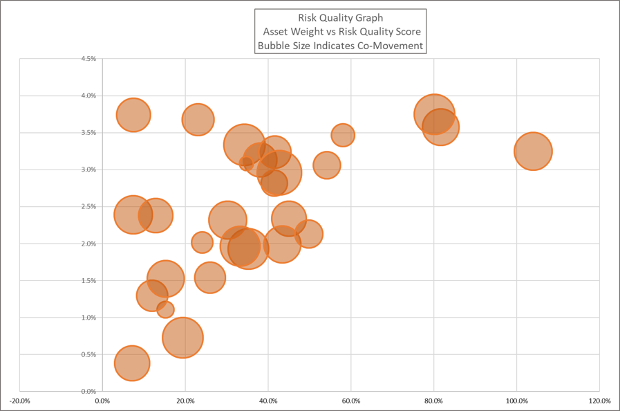
The Risk Quality Graph helps fund managers quickly view and understand critical drivers of their asset positioning. Sherpa developed the Graph to provide a tool for simplifying how various complex levers interact to help build better portfolios. Using this visualization gives fund managers a better understanding of their portfolio composition.
For the sake of clarity, in this post we’ll introduce a highly simplified version of the Risk Quality Graph to explain the general concept. In practice Sherpa utilizes a more computationally complex approach to Risk Quality that we’ll discuss in future posts.
Risk Quality Score
As documented in our previous posts on Portfolio Construction Process, the first step in most fund managers’ portfolio construction process is to generate investment ideas. As part of this process, managers establish a forward-looking view on the return prospects for each of the investments selected for the portfolio ie an Expected Return.
Each asset also has a certain riskiness that informs the manager’s view on the quality of the risk. Realized historical volatility is the most widely used measure of an asset’s risk, so for our simplified example we’ll use Volatility as our risk measure.
The concept of the Risk Quality Score of an asset is a combination of these two values. The Risk Quality Score of the asset is a function of the forward-looking view on the return of the asset against its riskiness. A forward-looking expected Sharpe ratio, or the expected return divided by the asset’s volatility, is a simple way of thinking about the Risk Quality Score of any given asset.
In practice there are many other important considerations that can go into determining the Risk Quality Score. One could use different measures to express the forward-looking view or the riskiness of the asset. For this discussion we’ll use Expected Sharpe to illustrate the concept though other Sherpa references generally refer to our internal approach to calculating the Risk Quality Score.
Risk Quality and Portfolio Construction
The Risk Quality Score concept gives us a foundation to understand the drivers of our portfolio composition. We’ll illustrate with simple visuals below.
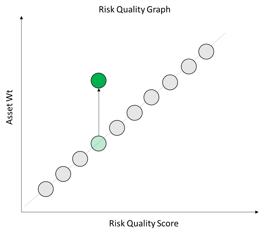
We start to build our Risk Quality Graph by showing the Asset Weight in the portfolio as a function of the Risk Quality Score. This shows how our forward-looking view on asset returns and their riskiness inform our portfolio construction decisions.
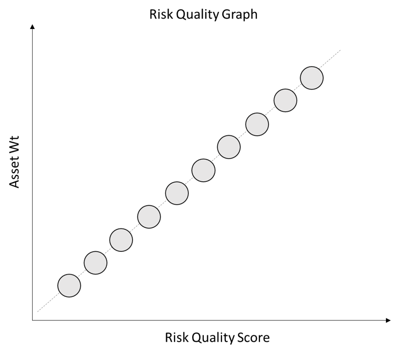
If all of the assets in our portfolio are uncorrelated, the “best” portfolio would simply weight the assets in line with their expected Sharpe ratio (the Risk Quality Score). However, in the real world our portfolio will never consist of a set of entirely uncorrelated assets.
Some assets will have less correlation to the rest of portfolio and thus help to reduce the overall portfolio risk. Other assets will be more correlated to the portfolio and thus have less value in reducing portfolio risk. We can think of this as the ability for each asset to help with our diversification or risk-control objectives.
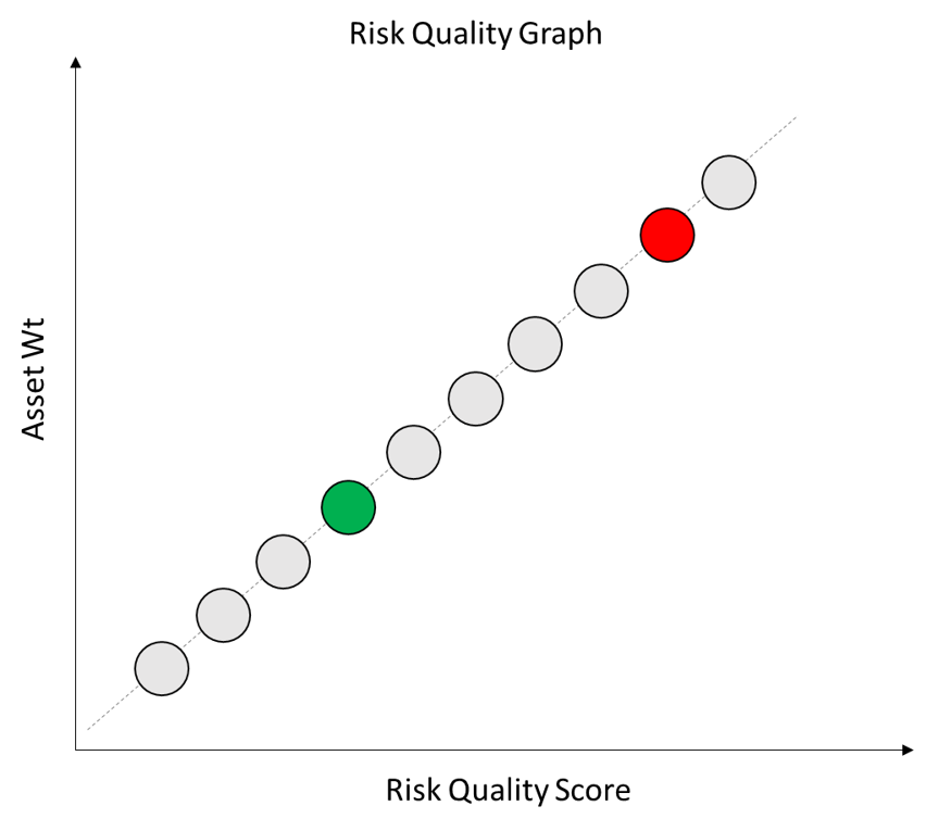
Co-Movement
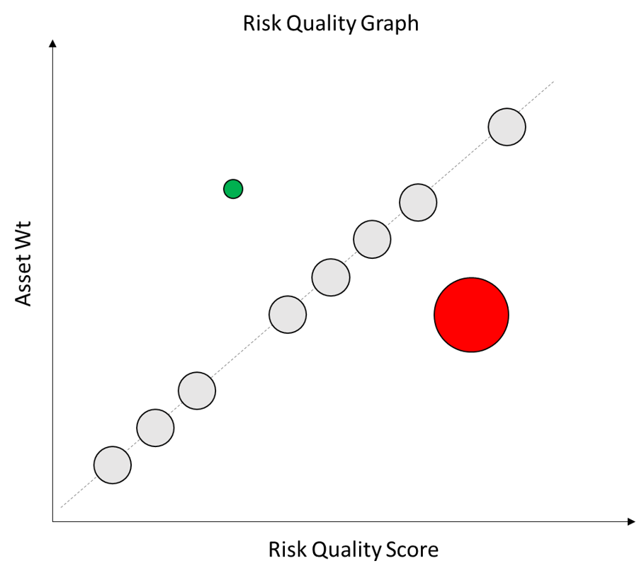
To account for this we need to add another piece to our visualization – Co-Movement. Co-Movement measures the degree to which the asset moves in sync with the rest of the portfolio absent that asset and thus acts as a good hedging instrument in the overall portfolio.
We’ve marked an asset on our chart in Red to indicate it has a high Co-Movement value and another in green to indicate it has a low Co-Movement value.
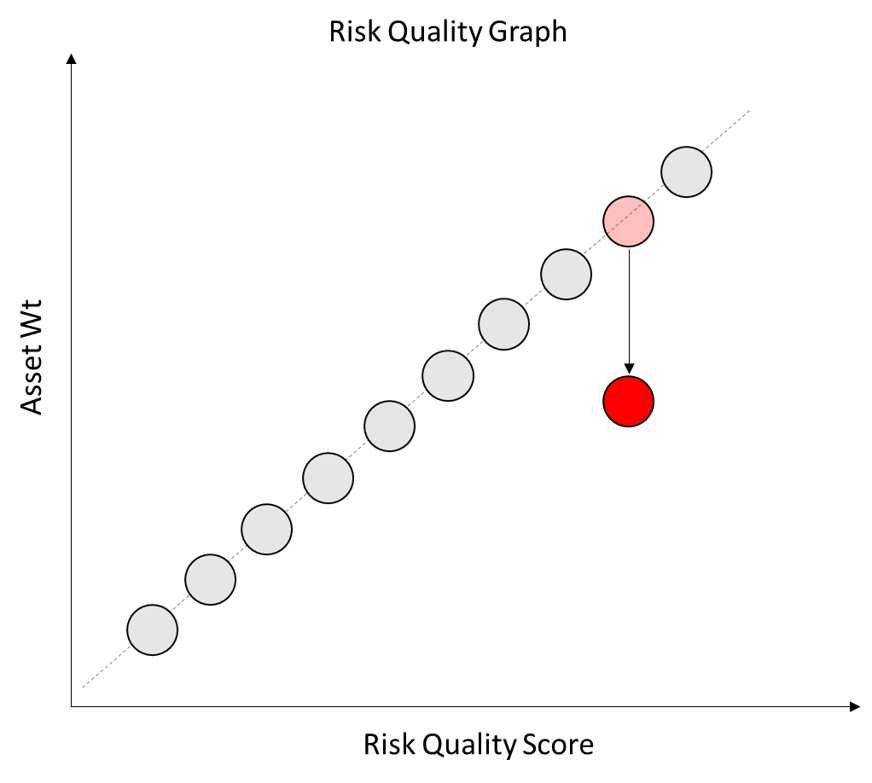
If an asset is highly correlated to the rest of the portfolio then it is less useful at diversifying the portfolio. The asset will tend to move in sync with the rest of the portfolio.
As a result, such high Co-Movement assets should be assigned a lower weight within the portfolio.
If an asset displays very low correlation to the rest of the portfolio then it is MORE useful at diversifying the portfolio. It will tend to zig when the rest of the portfolio zags and thus act as a useful hedging instrument.
Such lower Co-Movement assets should be assigned a higher weight within the portfolio.
To easily visualize the relative Co-Movement of the assets to the broader portfolio we’ve linked their size on the chart to their Co-Movement. Higher Co-Movement assets are shown with larger bubbles and lower Co-Movement assets with smaller bubbles.
Putting Together the Pieces
Combining the Risk Quality Score and Co-Movement, our portfolio asset weights can be thought of as a function of our forward-looking view of expected asset returns, the asset’s riskiness and its usefulness as a portfolio diversifier.
A well-constructed portfolio will generally assign larger weights to assets with higher forward-looking prospects (Risk Quality) and lower Co-Movement. Assets with higher Co-Movement and lower Risk Quality scores should receive lower weights. We can visualize this type of portfolio as below:
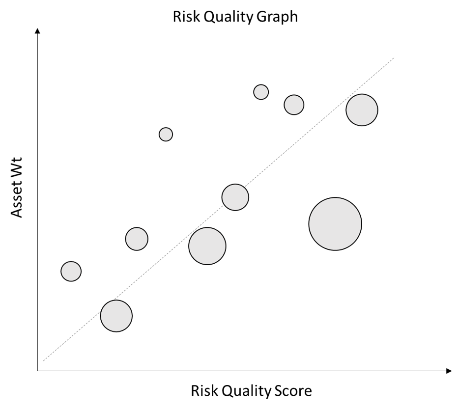
This visualization gives fund managers a powerful tool to quickly understand the drivers of their portfolio positioning and identify positions that need further consideration.
For instance, large positions with relatively lower Risk Quality and relatively high Co-Movement might call for reconsideration. The manager may well be comfortable with the size of that bet for idiosyncratic asset-specific reasons, or they may decide that adjusting their sizing would improve the construction of the overall portfolio by reducing the portfolio’s riskiness.
Building Portfolios with the Risk Quality Graph
Beyond visualizing the drivers of a single portfolio composition, the Risk Quality Graph lets managers quickly compare alternative potential portfolio configurations. Revisiting our real example from the start of the post, the below chart overlays a second alternative portfolio in Blue. Sherpa constructed the second portfolio to minimize drawdown risk while retaining the exposure to the manager’s asset scores and meeting all of their operational constraints.
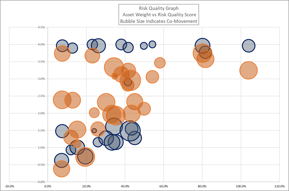
This example also starts to illustrate the impact of operational constraints on the resulting asset weights. Many of the assets with the highest Risk Quality Scores or the lower Co-Movement values have weights in the 3.8% – 4.0% range, bumping against maximum individual position size limits and sub-group limits.
Constraints on individual position weights, industries, geographies, factor loadings or other portfolio characteristics will all impact asset weights in a well-constructed portfolio. Integrating the core drivers of the graph with all of the objectives and constraints that make the portfolio practical and implementable makes the resulting portfolio construction problem very complex.
Building the “best” portfolio incorporating all of the asset-, group- and portfolio-level considerations is a high-dimensional computational problem best solved with systematic methodologies. Sherpa’s Risk Quality Graph provides a useful tool for simplifying and understanding all of the complex drivers required when taking a systematic approach to portfolio construction.
Future posts will discuss in greater detail how Sherpa implements these concepts with clients to improve their decision making and build better portfolios using systematic methodologies.
To see the potential impact of improved portfolio construction on your portfolio and learn more about refining your team’s portfolio construction process, get in touch with the Sherpa team or sign up for the SFT mailing list here.