
Portfolio Managers need to balance many competing objectives and constraints while expressing their views across a large number of assets. This is a complex problem and it is hard to find a way of showing that the solution (the invested portfolio) meets these objectives and does a good job of expressing the view. Even defining a ‘good job’ is hard: To me it means that the portfolio maximises the expression of the view (the risk the PM wants) whilst having the least amount of the risk that the PM doesn’t want, all while meeting the constraints that the PM is working under (sector or volatility limits etc.).
Typically, Fund management companies have risk departments that calculate statistics for the portfolio and present those stats in a table that shows compliance with pre-defined objectives (VAR, active share, tracking error, liquidity, sector or asset type limits etc).
And while this shows that the PM has satisfied the mandate, it does not show the PM how good a job they have done of constructing the portfolio. Satisfying the portfolio constraints is necessary, but these reports do not inform the PM as to whether they could have done better, instead of merely satisfying their constraints.
And because the PM is blind to the quality of their solution (beyond satisfying its minimum requirements), it is hard for the PM to improve on that solution. You can’t improve what you can’t see. The net result (based on our experience covering thousands of portfolios over the last 7 years) is that PMs typically leave 200-400bps p.a. (unleveraged) on the table.
So how can we show the differences in a portfolio? How can we help the PM measure the quality of their portfolio, and improve it so that they can capture these extra 200-400 bps?
To start with, let’s revisit a question that we asked in a previous blog:
‘Why it is hard to implement a systematic approach using mathematical tools for portfolio construction, even though the resulting risk and reward characteristics are very clearly better?’
Here we address the third reason. To refresh your memory, the first 2 reasons are:
- Organising Data so that you can use a computer to help solve the problem
- Asking the right question of the computer so the answer is useful
- Visualising the output in a way that makes it clear to all stakeholders that your portfolio construction does what you want it to and does a ‘good job’ of it.
#3 is very important: a good solution that no-one buys into is not a good solution. You can organise your data and ask the right questions, and even calculate a good portfolio, but if no one understands why it is good, then it will not be accepted.
Sure, the standard tables/reports show compliance with a limit framework, but that only explains the basics, not the quality of the solution.
We at Sherpa have developed ways to look at a portfolio, with which we can show how well the portfolio is constructed. This allows the PM to look beyond compliance with mandated limits and assess the quality of their portfolio construction. Using these visualizations, the manager can see how to make improvements in their portfolios, which will translate directly into improved returns.
These tools don’t improve the portfolio, but they make it easier to adopt an improved portfolio by showing portfolio characteristics in a way that highlights risk and alpha expression, and resulting performance differences.
Here we will discuss 2 ways of looking at portfolios that we and our clients find very helpful:
- Ex-ante visualisation: using the Risk Quality Score (RQS) graph
- Ex-post visualization through looking at realised performance versus the performance of possible candidate portfolios.
If you’d like to see more on this topic, we have gone over these in our Process Alpha webinars; the links are in the text.
First up, lets look at an ex-ante visualization of what a good portfolio looks like. We call this the RQS, or Risk Quality Score Graph.
The RQS graph shows a scatter plot of each asset:
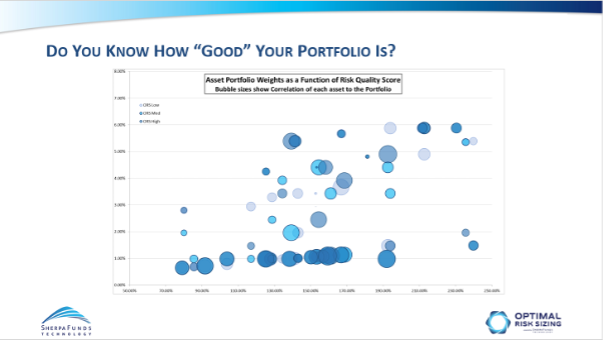
The X axis position shows the Risk-Quality Score, that is the PM’s Conviction score for each Asset divided by its ‘risky-ness’, [by which we at Sherpa mean its propensity to experience large downside moves]. As conviction grows, or riskiness falls, the asset moves to the right.
The Y axis position is the Asset’s weight.
Absent any other constraints, therefore we’d expect assets to be positioned roughly in a line, with higher weight for higher Risk Quality Score.
However, when we also look at how much downside co-movement the asset has with the rest of the portfolio and use that for the size of the Asset bubble, we see that assets with high RQS can have lower weight if their co-movement is high, and likewise assets with low RQS can have high weight if their co-movement is low.
Let me explain: an asset might have a high RQS, so be far on the right hand side of the graph, and therefore be expected to have a high weight. But if it has a high propensity to fall at the same time as the rest of the portfolio (i.e. think of a sub-portfolio made up of all the other assets at their particular weights), then that asset adds downside risk, will show with a large bubble and should have a smaller weight.
So, this graph shows you when portfolios are well constructed: Assets with high RQS & lower Co-Movement tend to higher weight.
We use the RQS to show that when a PM does a ‘good job’ of portfolio construction the assets are weighted so that those with large bubbles (higher co-movement) have lower weight than small bubbles and that those with higher Risk Quality scores have higher weight.
2: The Candidate Portfolio Graph
Ex-post visualization of the effects of good portfolio construction.
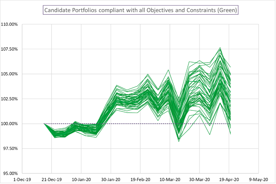
This graph can be generated some time after the portfolio has been constructed, and shows how a portfolio has performed relative to the set of all possible portfolios the PM could have constructed that are compliant with the mandate and express the views of the PM.
In this graph, each line is the return stream of one possible portfolio constructed from the same set of decisions, constraints and objectives. The portfolios are run forward on the real market data (this is not a market simulation), it is a reflection of the possible outcomes a PM could have experienced as a function only of the portfolio construction decisions.
There are two important points of the Candidate graph:
1: What is the spread of possible returns for the same set of assets? How large is this relative to the general trend of the graph.
Empirically we observe that the spread is often of the same order as the alpha: So a portfolio that returned 250bps over its benchmark over 6 months may have a 90%ile spread o possible results of around 250bps too. This means that the final returns are not just about the asset selection: asset selection Alpha can easily be swamped or enhanced by portfolio construction.
2: Where in this spread did the PM’s actual chosen portfolio come?
We see that experienced PMs who build portfolios heuristically (i.e. who don’t use tools like Sherpa) achieve around the median return most of the time.
Whereas Sherpas clients typically achieve the 65th – 70th percentile: In most cases this difference translates into 200-400 bps p.a per unit leverage.
This is the reason increasing numbers of sophisticated institutional investors use Sherpa to help them build better expressions of their view.
Ask Sherpa how we can help you gain an extra 200-400bps pa.