SFT’s Candidate Portfolio Analysis
Summary: Fund managers often have an incomplete view of the key drivers of P&L in their portfolio. As a result it is difficult to pinpoint what they’re good at and where they can improve. Sherpa Funds Tech created the Candidate Portfolio Analysis as a tool to help managers understand how asset selection, portfolio shape definition and portfolio construction drive their results. The Sherpa Candidate Portfolio Analysis shows portfolio managers many possible alternative outcomes so they can better understand how their portfolio is “good”.
Watch the related “How Good Is Your Portfolio?” webinar at the link.
How Good Is Your Portfolio?
Conventional portfolio risk and return statistics provide an incomplete lens to determine if your portfolio is “good”. Simply looking at the P&L alone lacks context – how did the portfolio do versus the benchmark, its peers, etc?
Even for a fund that’s performing well, looking at peer group and benchmark comparisons offers little insight into what part of the portfolio manager’s process drove the positive results. What was the relative impact of asset selection versus portfolio construction?
The Candidate Portfolio Analysis is one of the tools Sherpa Funds Tech has developed to help PMs understand how “good” their portfolio is. The Candidate Portfolio Analysis helps the PM dig deeper to understand how their asset selection and portfolio construction decisions contribute to their portfolio’s P&L.
Analysing the real drivers of portfolio P&L gives the PM insight into the strengths and weaknesses of their process so they can identify areas for potential improvement. This tool also helps managers understand the magnitude of potential changes so they can better understand the risk they’re taking and the business impact of improvements to their process.
Different Ways to Express the Same Alpha
In a process-driven approach to portfolio construction, the portfolio manager is responsible for generating alpha through their asset selection and defining the “shape” of the portfolio that will express that alpha consistent with organizational requirements. In more simple terms – picking the stocks and setting the objectives and constraints.
Then the PM must construct a portfolio from those assets that meets those constraints. This can be done many ways, from purely discretionary heuristics to fully systematically.
The following example shows how a Candidate Portfolio Analysis helps better understand the quality of a PM’s asset selection and portfolio construction decisions. This portfolio data comes from a $1.5bn USD Emerging Markets Equity fund benchmarked to the MSCI Emerging Markets Index. The manager provided this portfolio snapshot in Q4 2019 for analysis and the resulting portfolios were tracked out of sample through the start of 2020.
* Note – all graphs and tables show benchmark-relative performance and risk metrics. All data is real and out-of-sample.
The portfolio manager defined the “shape” of their portfolio as follows:
Objectives:
- Maximize expression of the Alpha in the PM’s stock picks
- Minimize damaging drawdowns without increasing volatility
Constraints:
- Tracking Error v bmk 4% – 10%
- # of Assets included 70-80
- Country Exposures +/-15% vs BMK
- Sector Exposures +/-15% vs BMK
- Asset Wts vary by -75bps to +300bps vs BMK
Let’s look at the largest positions in three portfolios created using the same asset selections and complying with the same set of objectives and constraints above. The first is the PM’s Original positioning, the second two are alternates that still meet all of the stated constraints and are consistent with his convictions.
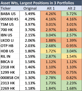
At first glance its clear the resulting position sizes are different, but what does that mean in practice?
Same Ideas but Very Different Results
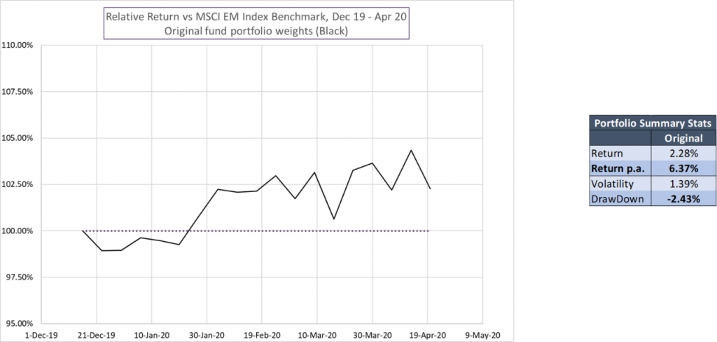
The graph and chart above are what most PMs see ex-post when evaluating how “good” their portfolio was – the P&L generated by the portfolio and a few reference risk and return statistics. While the portfolio trailed the benchmark for the first few weeks of the period, it rallied strongly in late Jan and outperformed over the full period. It beat its benchmark with controlled volatility and drawdown. The portfolio was good!
To better understand just how good the portfolio was and what made it good, let’s look at an alternate set of weights that could have been created from the same stock picks.
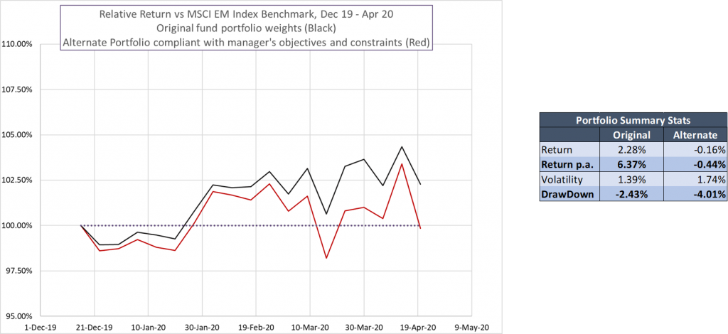
This portfolio is decidedly less good! The return stream looks very similar to the Original portfolio, but greater drawdowns eliminated the outperformance and it ended the period trailing the benchmark. Both tracking error and benchmark-relative drawdown were much higher as well. Again – the same picks just with alternate weights.
This is our Alternate 1 portfolio from above. Now let’s add in Alternate 2.
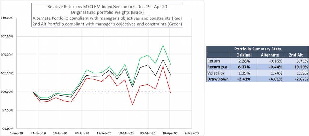
Again the return stream of the second Alternate portfolio looks roughly similar to the Original portfolio and is constructed from the same asset selections. But again the statistical results are very different!
This portfolio construction achieved much larger returns – 60% higher – with a risk profile much closer to the Original portfolio.
These three examples demonstrate two important things – the asset selection and shaping decisions by the PM determine broadly how the portfolios can perform, but the actual portfolio construction can have a huge impact on the realized results! In this example great portfolio construction could have added 140bps of return in a few months or wiped out the PM’s alpha entirely.
The Candidate Portfolio Analysis
The Candidate Portfolio Analysis expands this concept to create a very large number of portfolios from the selected assets that complying with the stated constraints. This is the eligible universe of Candidate portfolios – that is the set of portfolios that the PM COULD have created given his inputs above.
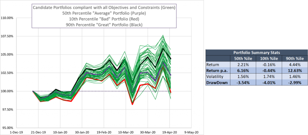
Our Candidate Portfolio Analysis then takes a sampling of the full universe to produce a chart like this:
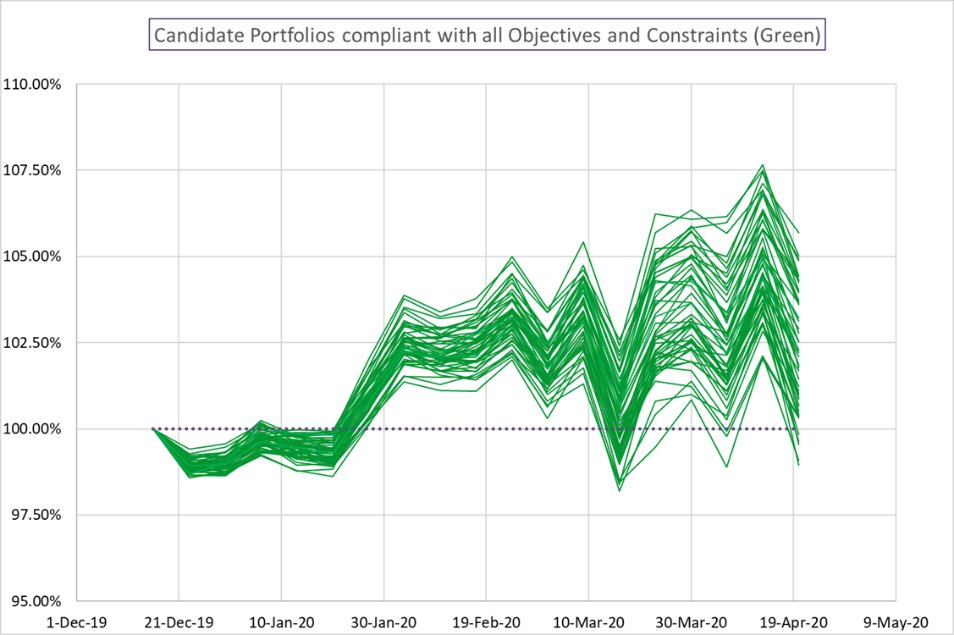
This chart lets the PM visualize the range of possible outcomes given their asset selections and their stated portfolio objectives and constraints. As before, we can see there is a broadly consistent direction and path to the return streams – after all they’re created from the same assets. However the range of outcomes is very wide indeed… from more than doubling the realized returns above benchmark to actually trailing the benchmark!
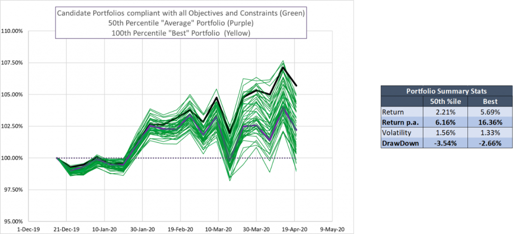
The best portfolio produced a 5.69% return on very similar risk to the Original portfolio.
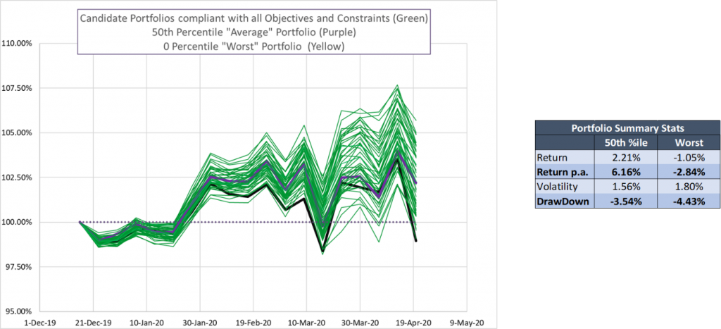
The worst portfolio produced a -1.05% return on slightly elevated risk. That’s more than 6% lower than the best portfolio and more than 3% below the PM’s Original implementation!
Huge Range of Results – How Much is Selection?
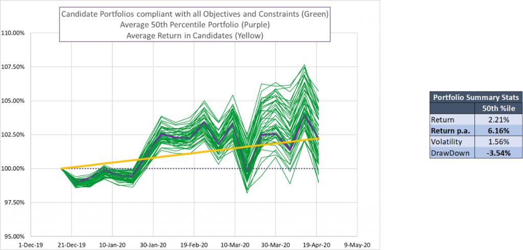
Looking at the 50th percentile outcome – basically the median portfolio – shows a 2.21% return. Visualizing the returns provides context into the PM’s lived experience in a way a simple summary return cannot. We can see the period of initial underperformance as well as the sudden drawdown and recovery in March.
This median result, or alternatively the average of portfolio outcomes for when the distribution of outcomes is non-normal, gives us a reasonable assessment of the impact of the asset selections subject to the PM’s constraints. On average, a portfolio construction that was neither particular good nor particular bad would produce 2.21% returns above the benchmark.
At this point we’ve established a number of important takeaways from the portfolio manager. The first critical two are:
- The range of possible outcomes from their ideas (quite large in this case).
- The impact of their asset selection absent good or bad portfolio construction.
What Kind of Outcome Can We Hope to Achieve?
But when considering how good their portfolio construction was, we have to consider both the range of possible outcomes and the range of outcomes that they could realistically hope to achieve.
This is an important and oft overlooked consideration when using quantitative portfolio construction tools. In practice achieving the “best” portfolio requires the PM to be absolutely correct about how the market will unfold – that is to say there is no room for estimation error. While it may happen once in a very great while that the PM lucks into the 100th percentile outcome, the best portfolio above is not a realistic benchmark.
We can say the same about the worst portfolio – the PM would need to be absolutely wrong in a way that is similarly unlikely to achieve the very worst outcome.
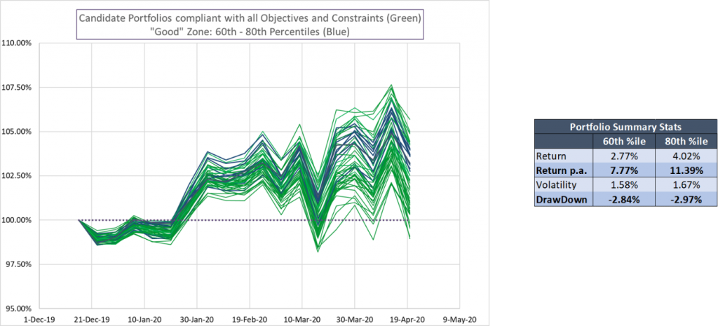
Trimming those tails off our candidate sample, Sherpa frequently looks at the spread between the 90th percentile and the 10th percentile as representative of the potential impact of portfolio construction. While no PM is likely to consistently reach either extreme, it gives a more realistic gauge of the range of possible portfolio returns.
In this example that that trims the spread from 6.74% (best – worst) down to 4.60% (90th – 10th). This still represents a massive potential impact from good (or bad) portfolio construction!
Is Your Portfolio in The Good Zone?
Our experience at Sherpa Funds Tech has shown us that while PMs cannot consistently achieve the 90th or 100th percentile outcomes, using the correct techniques they can consistently do better than average. We define the “Good” zone as being between the 60th and 80th percentile in outcomes. The “Good” zone results are better than average, but not unrealistically accurate in terms of required fore-knowledge.
The “Good” zone for this portfolio is shown below. These portfolios ranged from 2.77% to 4.02% returns. This is still not a small difference! Our experience shows that PMs can achieve this type of “Good” result consistently.
Revisiting this PM’s Original portfolio using the Candidate Portfolio Analysis we can see that while the asset selections were quite strong the portfolio construction was just OK. It was better than average – 2.28% return versus the median 2.21% return – but not by very much. The portfolio construction impact was shy of the “Good” zone by this measurement.
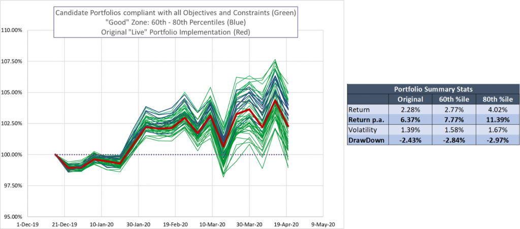
This Candidate Portfolio Analysis showed this portfolio manager what he was doing well (asset selection) and what he could improve (construction and sizing). It also quantified the potential impact of improving his construction decisions.
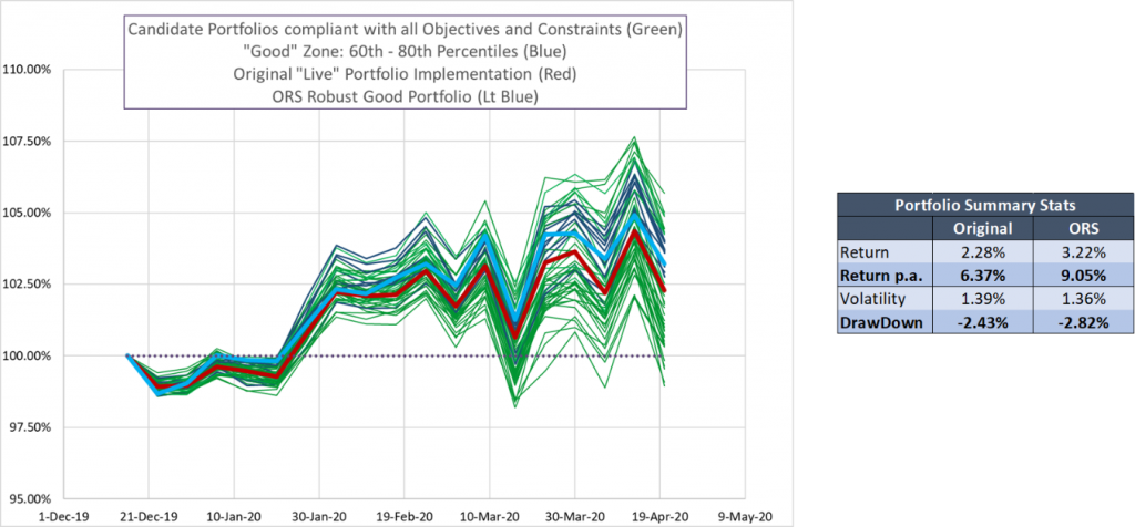
Move Your Portfolio into the “Good” Zone
This fund manager worked with Sherpa to construct a portfolio that helped maximize the value from his asset selection. The Sherpa ORS portfolio improved returns by +260bps per annum as the PM moved from merely average portfolio construction into the “Good” zone.
The Candidate Portfolio Analysis is one of many tools Sherpa Funds Tech uses to help PMs refine their portfolio construction process and improve their decision making. This looks at the realized results to illustrate how “good” their portfolio is and identify areas of potential improvement. The Risk Quality Graph looks at the portfolio’s positioning to show how well-constructed the portfolio is ex-ante.
Future posts will discuss how using these tools and systematic methods can help PMs consistently land in the “Good” zone.
To see the potential impact of improved portfolio construction on your portfolio and learn more about refining your team’s portfolio construction process, get in touch with the Sherpa team or sign up for the SFT mailing list here.